The Chinese Art of Spotting Great Calligraphy Without Reading It
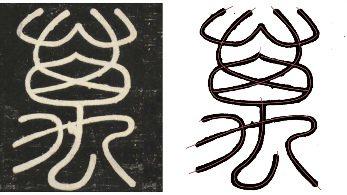
For most outsiders, Chinese calligraphy looks like beautiful but impenetrable decoration. You can admire the sweep of a brushstroke without having any idea whether what you are looking at is a masterpiece or a beginner’s practice sheet. A widely shared answer on Zhihu, China’s Quora-style question-and-answer platform, offers a surprisingly practical way in: stop trying to read the characters, and look at the lines instead.
The author, who writes under the pen name Huang Jiazhi and runs a calligraphy practice account, begins with seal script, the oldest of the major styles. His rule of thumb comes from a Tang dynasty treatise on calligraphy: seal script values being rounded and connected. The lines curve naturally, with few sharp angles, and they flow into one another without awkward breaks where the brush lifted off the paper. He points to a character carved by Li Si, the Qin dynasty official credited with standardizing Chinese writing, and to a later example by the Qing scholar Deng Shiru, where even a two-stroke frame reads as a single continuous movement.
That principle of continuity runs through the whole tradition. Clerical script, which developed as writing moved from carving to brushwork, flattens and widens the strokes, giving characters a stable, almost architectural stance. Cursive script does the opposite, compressing and linking strokes until the writing becomes a kind of shorthand for the hand’s rhythm. Running script sits in between, legible but relaxed, and it is the style most people encounter in everyday handwriting. Regular script, the blocky form children learn in school, is the strictest test: every stroke is separate, so any hesitation or wobble is instantly visible.
The advice is useful precisely because it sidesteps meaning. A viewer who cannot read a single character can still notice whether a line is smooth or shaky, whether the ink is evenly controlled, whether the spaces inside and between characters feel balanced. Calligraphy teachers in China often describe this as looking at the skeleton before the skin. The structure of a character, its proportions and the tension between dense and open areas, carries much of the aesthetic information.
Calligraphy remains a living practice in China, not a museum relic. It appears on shop signs, in parks where older men trace water characters on paving stones with oversized brushes, and in a booming market for classes and supplies. Museums such as the Palace Museum in Beijing and the Shanghai Museum hold celebrated collections, and major works by historic masters regularly draw long lines when they go on view.
For beginners, the Zhihu answer also carries an implicit warning. Because calligraphy is judged on line quality rather than likeness, a confident forgery or a slick imitation can fool an untrained eye for a while. The remedy is the same as in any art form: look at a lot of good work. Comparing a rounded seal script stroke with a crisp regular script one teaches more than any rule.
Perhaps the most appealing part of the method is how democratic it is. You do not need to know what a character means, or which dynasty it came from, to sense whether the brush moved with control and intention. That is a low bar for entry and a high bar for mastery, which may be why the question, and the answer beneath it, keeps circulating among readers who will never pick up a brush themselves.